Search This Blog

Friday, May 17, 2013

Writings Without Borders

Group Exhibition
Writings Without Borders
curated by Hervé Mikaeloff
21 May - 20 July 2013
Opening Reception: Tuesday, 21 May, 6-9 PM

group


Hong Kong, 8 May 2013—Lehmann Maupin, Hong Kong is pleased to announce that renowned international curator Hervé Mikaeloff has organized a dynamic group show featuring a selection of Eastern and Western contemporary artists exploring notions of language. The show, entitled Writings Without Borders, will highlight a wide variety of artistic styles, ranging from painting, drawing, photography, embroidery, and neon, by Tracey Emin, Teresita Fernández, He An, Shirazeh Houshiary, Idris Khan, Barbara Kruger, Eko Nugroho, Pak Sheung Chuen, Robin Rhode, Tsang Kin-wah, and Zheng Guogu.


To write could be defined as the action of transferring a word, a thought, an idea, a story, a dream from an undefined state to the fixity of a graphic sign. Writing can be the expression of a gesture (drawing, painting, dripping…), a way to keep a trace of the past (history and memory), an intimate biographical testimony, or a public announcement. It is also the place of several types of contradictions: civilization of sign and that of the image, mystery and clarity, the indecipherable and the revealed, symbolism and meaning. Writing as language is also a central question in the relationships between different cultures and civilizations, particularly Eastern and Western.


Both in the East and West, artists play with their respective alphabets, words and phrases, using writings, imprints, signs and traces. For some of them, art is simply language. Traditionally in China, there is also an idea of equivalence between art and writing. Drawing and painting belong to Chinese language and writing. During the 20th century, the heritage of calligraphy almost disappeared and finally reemerged as a strong artistic expression more than 25 years ago, whether it is used for formal exploration or for social and political criticism.


In Writings Without Borders, artists from very different countries and origins come together with their own approach to writing and the universal themes that relate to it. In many cultures such as Arabic or Chinese, calligraphy is used as a path to meditation and poetry like in Shirazeh Houshiary’s practice of painting, in which she layers calligraphic script until it effectively dissolves into abstraction. Idris Khan also refers to this tradition with his monochrome works stamped repeatedly with words resulting in almost indecipherable layers, fading like traces in our memory.


In her “Night Writing” series, Teresita Fernández references “Ecriture Nocturne,” an early type of encoded writing similar to Braille invented in the early 19th century to help soldiers to communicate in the dark. Engraving the gallery wall with the word ‘moon,’ Hong Kong artist Pak Sheung Chuen reveals the potential of sign as a visual language to reveal unexpected connections when translated from English to Chinese.


Two other artists from the same region share this conceptual approach to writing: Tsang Kin-wah and Zheng Guogu. Using decorative qualities of calligraphy, Tsang Kin-wah combines the beauty of floral ornamentation with crude words spelling out the physical, sexual, and material obsessions of our contemporary world. This concern is echoed in a painting by Zheng Guogu showing scripts of various logos and advertisements with Hong Kong’s famous Pedder Street in the background. The confrontation of words and images is represented in the work of another major artist, Barbara Kruger, who utilizes both to criticize consumer culture and our fascination for mass media.


From the public to the intimate, Indonesian artist Eko Nugroho has based his snapshot embroideries series on the photographs he takes from the streets of a foreign city or at home in his studio as a documentation of his every day life like a personal dairy. The relation between public and private is also tested by Tracey Emin and He An, both of whom use neon writings as a visual poetry to express their emotions. Another form of poetry from the street is present in the works of South African artist Robin Rhode who brings together body and sign in a choreographic gesture.

Poetic Everyman Project

Pameran hasil proyek bersama yang diinisiasi dan dikurasi oleh seniman yang terlibat di dalam;


Exploring Mythology in the Contemporary Context


Part 1 : MICRO-Cosmos/MACRO-Cosmos
Pembukaan : Sabtu, 18 Mei 2013
Pukul : 19.30 wib


Live Performance oleh Dyah Purwitasari pukul 15.00 wib setiap :
Jumat, 26 Mei (diikuti oleh diskusi)
Sabtu, 27 Mei
di SANGKRING ART PROJECT
Jl. Nitiprayan 88, Ngestiharjo Kasihan Bantul
YOGYAKARTA

sangkring

Artist:

Amina McConvell (AUS)
Briony Galligan (AUS)
Dyah Purwitasari (INA)
Jumaadi (INA based in Sydney AUS)
Lashita Situmorang (INA)
Rachel Hill (UK)
Raffaella McDonald (AUS)


"...Secara singkat, konsep proyek pameran ini adalah mengumpulkan respon seniman yang terlibat terhadap tema Micro-cosmos/ Macro-cosmos, yang diambil dari filosofi Kejawen. Dalam filosofi Kejawen, konsep micro-cosmos/macro-cosmos mempunyai arti bagaimana kita sebagai manusia (dalam hal ini badan yang mewakili micro-cosmos), yang menempati sebuah fisikalitas dan mempunyai jiwa dan raga, dan hubungannya dengan alam raya (macro-cosmos). Dalam konsep Kejawen, perihal micro-cosmos dan macro-cosmos merupakan sebuah kesatuan yang nyata di alam sadar maupun bawah sadar. Karena para seniman yang terlibat mempunyai kultur dan latar belakang artistik yang berbeda-beda, penting halnya dalam pameran ini para seniman mendapatkan kebebasan dalam menginterpretasikan tema pameran ini.


Penelitian kolaboratif pameran ini melalui proses, kegiatan diskusi informal dengan topik yang bervariasi sekitar spiritualitas, mitologi, dan agama di Yogyakarta, dengan tetap berfokus pada tema pameran kami, Micro-cosmos/ Macro-cosmos. Kami memulai pendekatan ini melalui interaksi dengan pihak-pihak yang berkepentingan di dalam komunitas ini, para informan di dalamnya termasuk penasihat ndalem Keraton, penyembuh spiritual, praktisi pengobatan tradisional, penjual makanan di jalan, teologis, para teoris kebudayaan, pemilik kios-kios di jalan, dan akademisi. Kami bertanya jika mereka berkenan untuk berbagai mengenai kepercayaan spiritual atau mitologisnya kepada kelompok kami. Melalui percakapan yang terjadi, kami mulai mendapatkan rasa yang profan, sakral, dan ide-ide dengan bawaan alami yang diekspresikan kepada kami melalui para informan.


Tujuan dari riset yang kami lakukan ini adalah menyediakan sumber-sumber materi bagi para seniman dan juga untuk membumikannya dalam sebuah proyek, serta dengan komunitas masyarakat sebagai konteks dan aspek kolaboratif. Melalui pertukaran serta kebebasan berbagi ide-ide, terbentuklah sebuah pertemanan dan kemitraan intelektual yang kuat di antara kami. Sebagai sebuah kelompok, kami melihat proyek ini sebagai sebuah cara untuk menggali beberapa nuansa kultur tersembunyi yang humoris, dan kuat, yang dapat menjadi dasar sebuah pertukaran kebudayaan yang menarik. Dari proses kolaboratif itulah masing-masing seniman dapat membangun interpretasi pribadinya untuk menanggapi tema pameran melalui proses berkarya di studio "
Amina McConvell

ALIGNMENT

ALIGNMENT - A GROUP CONTEMPORARY ART EXHIBITION
Date Opening: 6.30pm 18th MAY – 18th JUNE 2013.
Venue: Bidadari Art Gallery
Owner: I Made Sudiana
Jl. Raya Mas 47, Gianyar

bidadari

Curated by: Richard Horstman
Artists:
1. I Gede Made Surya Darma (Indonesia)
2. I Putu Wirantawan (Indonesia)
3. Pras (Indonesia)
4. Niccolò Italo Maria Bernasconi (Italy)
5. I Kadek Dedy Sumantra Yasa (Indonesia)
6. Sanjiwani (Indonesia)
7. Vony Dewi (Indonesia)


Curator’s Brief.


Alignment
The human body is a ‘vehicle’ of phenomenal, yet often misunderstood dexterity and intelligence. Its capacity for restoration and renewal often defies the so-called medical experts. Through simple, noninvasive stimulation of the senses our body’s innate abilities to regenerate, and in essence create “new life”, are easily initiated.


The exhibition Alignment presents the work of seven contemporary artists via the mediums of sketching, painting, installation, performance and film.


What defines Alignment from other exhibitions is its intention to communicate beyond the “general aesthetic experience” and to provide insights and explanations as to how the human body and mind interact with art on deeper levels.


Via the visual, audio and energetic “tools” utilized by the artists their works project information that is decoded by the mind and the auric field, and that arouse intelligent responses and induce adjustments within the body’s self regulating systems.


Alignment is an invitation from the artists to audience to increase their awareness and bring greater understanding to what occurs on the conscious, subconscious and metaphysical levels, while engaging with the works of art.

Wednesday, May 8, 2013

REPLAY Art Exhibition

replay

Re-Play is Solo exhibition program who supported by OFCA (Office For Contemporary Art)

at this time the exhibition artist is JUMALDY ALFI

opening on friday, may 10, 2013

Re-Play merupakan program serial pameran tunggal oleh Office For Contemporary Art (OFCA) International yang secara intensif bekerjasama dengan PartNER sebagai penyelenggara acara di Yogyakarta, Indonesia. Program ini dirancang berdasarkan pada pemikiran bahwa karya seni adalah sebuah hasil dari proses produksi intelektual; sesuatu yang hidup dan terus berkembang. Acara ini mengutamakan penampilan kembali karya seni yang telah dihadirkan kepada publik dengan tujuan untuk dapat mengamati dan membaca lagi pikiran-pikiran seniman lebih mendalam, sebagai suatu pengalaman yang konkrit. Terkait dengan kata “Re-Play”, konsep kuratorial dan penyeleksian karya berpijak pada unsur-unsur “main” dalam arti yang seluas-luasnya.

Re-Play#3 mempresentasikan satu bagian dari proses berkesenian seniman Jumaldi Alfi berjudul “Coverboy”, 2000-2003. Bagian dari proses yang dimaksud merupakan sekumpulan lukisan yang diproduksi untuk digunakan sebagai ilustrasi sampul-sampul buku oleh beberapa penerbit di Yogyakarta dengan perkiraan buku sebanyak 125 judul. Namun, pada pameran ini ditampilkan kembali 2 lukisan, 15 objek buku dalam bingkai kaca dan 45 buku yang ditata di atas meja kaca serta satu video sebagai pembacaan ulang terhadap proses tersebut. Karya-karya ini di antaranya pernah dipamerkan pada tahun 2003 dalam pameran tunggal Coverboy di Centre Culturel Francais dan pameran Membaca Ruang-Ruang di Rumah Seni Muara di Yogyakarta, Indonesia.

Pameran dibuka: Jumat 10 Mei 2013, jam 16.00 wib

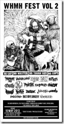
WHMH FEST VOL 2

whmh

One more exhibition and musical art will be held on Rossi Music Fatmawati JAKARTA, indonesia.

WHMH FEST VOL 2
AT ROSSI MUSIK FATMAWATI
FRIDAY, 10 MAY 2013


LIVE ACT (Artist) :

TERSANJUNG 13
VAARALLINEN (SNG)
WICKED SUFFER (JGJ)
GHAUST
OATH (BDG)
DURGA (Cipanas)
PROLETAR
KONTRADIKSI (BDG)
TRIGGER ATTACK (BALI)
BUSUK (DPK)
BAR BAR
SONATA
EXECUTED
DUCT TAPE SURGERY
WOUND (JGJ)
RAINCOAT
PECAH KEPALA
BORED


EXHIBITION BY:
GILANG MERDEKA, ZULFIKAR AHMAD SUNDADJAJA (BDG), MAMAT AHEE (JGJ), PARASHINA (Palembang), FIQI BARKAH AND TORO ELMAR.

TAKSU Singapore

taksu


TAKSU Singapore and Art Angel Company are pleased to co-organize the contemporary Korean art exhibition, New Waves, Korea in Singapore from 9th to 29th May in 2013. The works of New Waves, Korea contains the inner voice of modern people who seek for something that has been lost or missing. The exhibition features works of three contemporary Korean artists, Kim Kun Ju, Sang Taek Oh and Sung Chul Hong. They are the significant artists in Korea with innovative work process and profound concepts. Each of the artists’ works brings out the fundamental issues of the modern society through the different mediums and materials.

Venue: 43 Jalan Merah Saga, #01-72 Workloft at Chip Bee, Singapore 278115

Dates: 9 – 29 May 2013

Opening Reception: 9 May 2013, 6:30–10pm

Wednesday, May 1, 2013

Business Card Design

Moontree-2

In this Article we want to share about 10 thing that must be avoid when we want to design  the business card for your professional business:

1. A business card is not a storage unit you cram all of your stuff into any which way it will fit. Leave some white space so that the essential information stands out clearly and with confidence. Too much information and you look desperate, as if you're using anything you can think of to convince everyone that you know what you're doing. If you need to include additional information, print that on the back. so avoid the Clutter design

2. Tiny Print. Make people squint, and they aren't going to bother. They might even feel old and nobody wants to feel old. Don't let your card induce bad feelings of any kind or you'll be associated with those feelings as well. You want people to look at your card and feel warm and curious and thinking about how they could really use your services.

3. Cheap Paper. Choose card stock that has some weight to it, that feels good to the touch. You want to make a significant impression. Cheap paper leaves the impression you aren't worth much yourself.

4. Font Confusion. A business card is not the place to experiment with funky fonts. Pick an easy-to-read font that represents the tone of your business. Do not mix too many font types or sizes. For example, "matisse" may look enticing, but may not be the best choice for a professional card.

5. Color Overdose. Pick two or three colors that match your other business materials, such as your logo, website, and stationery. You're trying to create a brand that is consistent and easy-to-recognize. Don't let your message or information be lost in a whirlwind of color or images. Be sure your print is dark enough to read easily and isn't overshadowed by surrounding images.

6. Shapes and Sizes. Stick with the standard 31/2 x 2-inch card. Some people insert their cards into binders that depend on standard sizing. What if your card were thrown out just because it didn't fit in a plastic sleeve? There are ways to jazz it up within the limits. Consider getting rounded corners, for example, or orienting the print vertically instead of horizontally.

7. Mixed Messages. If you own a landscaping service, flowers on your business cards could work. If you're a lawyer, not so much. No one will take you seriously. The card needs to capture the nature and tone of your business, not your favorite cartoon character or favorite animal print. That being said, if you manage a costume shop or perform at children's birthday parties, go as full-out wacky as you'd like.

8. Creative Within Limits. The possibilities are endless when it comes to how creative you can get with business cards. They can be three-dimensional or even have moveable parts. But before you order a business card that pops apart and fits together to make a paper airplane, think of the cost of each card. You don't want your cards to cost so much that you're hesitant to pass them out. Secondly, creativity is a good thing, but sometimes less is more. Instead of going overboard, maybe putting only minimal information with a striking color contrast makes a stronger statement. You want to intrigue the recipients of your card, not shock them.

9. Be Memorable.Even though simple will always trump over-the-top, you need to make a memorable impression and leave the recipient of your card wanting to know more. A friend of mine runs an online retail clothing company. His business card follows all of the rules above, but it looks like a clothing tag. As soon as I see that card, I visualize not only my friend, but his company and what his company sells. Sometimes being creative within the limits is more creative than breaking all the rules.

10. Avoid the Poor grammar, spelling, or spacing reflects poorly on yourself and your company. If you don't take the time and care to make sure your own business card is accurate and of good quality, then potential clients will assume your products or services are given the same sloppy treatment. Treat your card the way you would treat your clients.


Blogger news

Visitors

Reading List

Blogroll

Art | Dzn. Powered by Blogger.